
Project Objectives
Develop visual understanding of the differences between subject matter and form.
Intentionally translate Value into Color.
Develop visual understanding of Color Schemes/Harmonies.
Develop practical understanding of the how to create Monochromatic, Analogous and Complementary Color Harmonies.
Project Description
In this project you will work with Gouache to translate Value into Color by exploring Monochromatic, Analogous and Complementary Color Harmonies.
Required Materials
Your second version of the Texture Project One (1) Sheet of 9" x 12" Drawing Paper One (1) Sheet of 14” x 17” Bristol Board Set of Gouache Paint Paint Brushes Mixing Palette Container for Water Cloth Rag HB Pencil Eraser Scissors Xacto Ruler Glue Stick Rubber Cement
Step-by-step Directions
Before you start complete Exercise 3: Color Studies.
Part 1: Develop Sketches
Divide the 9"x12" Drawing paper in four to create four (4) 4.5" x 6" working areas.
Reproduce the design you created in Project 5: Texture Version 2 by drawing in pencil the shapes created by the different textures.
Note that you only need the dominant shapes of the composition not the textures.
Only use line, do not shade in areas, or use color in this version. You are looking for the main lines and shapes that create the composition.
Your drawing should take up the ENTIRE field (4.5” x 6”), reaching the edges. Fix any design flaw.
Make sure the focal point is on one of the power points of the rule of thirds. Share with prof. Jacques.
Now transfer the composition to the other three sheets of (4.5” x 6”) drawing paper. In other words, you should have the same composition repeated in four (4) different sheets of (4.5” x 6”) of drawing paper.
Part 2: Color Studies Sketches
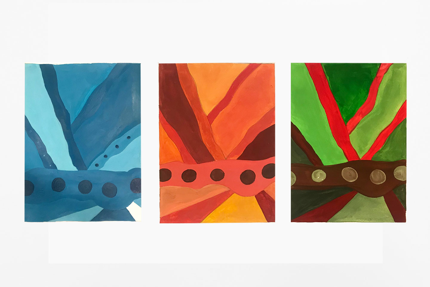
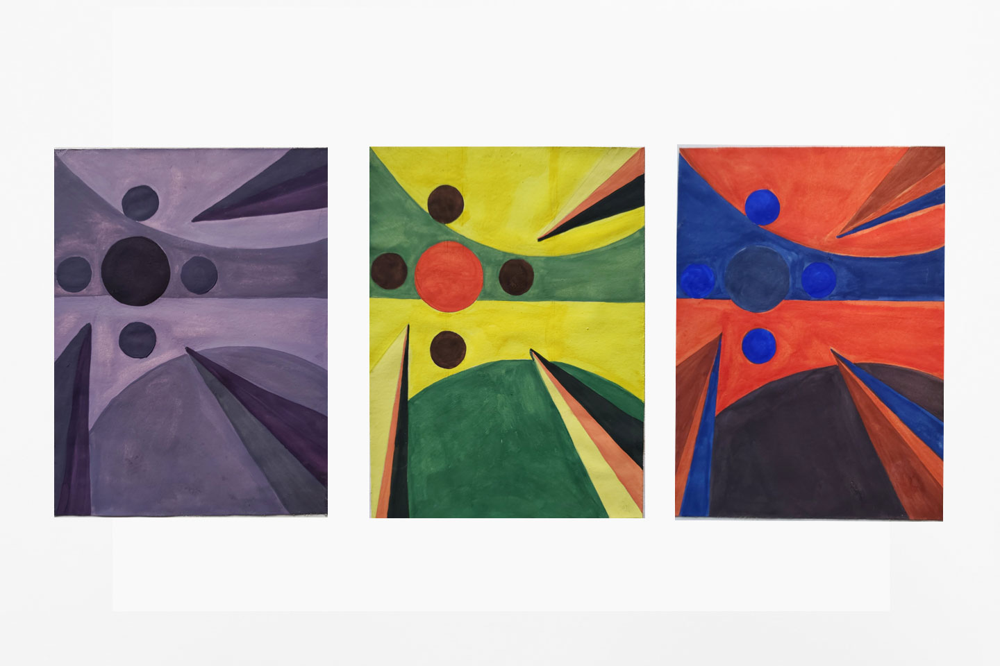
Choose a primary color and paint with gouache one of the designs in a monochromatic color scheme.
Make sure the painting includes at least all 9 different values from your monochromatic study. DO NOT USE ANY OTHER COLOR (only 1 hue, black and white). No areas of your image should be left unpainted.
Use Exercise 3 as reference for your Color Studies.
For each study, experiment with creating a focal point and visual flow with value contrast, color saturation, color temperature (analogous & complementary studies only), and simultaneous contrast (complementary studies only).
Paint with gouache one composition in a analogous color schemes.
Choose any 3 hues on your color wheel that are directly next to each other. Make sure the painting includes at least 9 different color variations mixing those 3 analogous hues, white, and black. No areas of your image should be left unpainted.
Use Exercise 3 as reference for your Color Studies.
For each study, experiment with creating a focal point and visual flow with value contrast, color saturation, color temperature (analogous & complementary studies only), and simultaneous contrast (complementary studies only).
Paint with gouache one drawing in a complementary color schemes.
Make sure the painting includes at least 9 different color variations mixing those 2 complementary colors. You may mix white and black into some of your colors, but do this as minimally as possible. Try making your colors darker by mixing your complements. No areas of your image should be left unpainted.
Use Exercise 3 as reference for your Color Studies
For each study, experiment with creating a focal point and visual flow with value contrast, color saturation, color temperature (analogous & complementary studies only), and simultaneous contrast (complementary studies only).
Once each of your paintings are complete, mount the three color compositions next to each other them on a 14”x17” Bristol board using your rubber cement glue. Make sure the paintings are aligned horizontally on the cardboard, use your ruler to create guidelines with pencil before gluing.
Project Considerations
Were the proper combinations of hues used to reproduce the color schemes: Monochromatic, Analogous and Complementary ?
Are all areas of the picture plane painted?
Were the colors mixed and applied with skill?
Were all the different shades reproduced on the Monochromatic, Analogous and Complementary paintings?
Are the final paintings been executed in a professional manner? Designs should utilize the designated materials with care, effort, and attention to detail. This includes proper mounting to Bristol Board.
CRAFTSMANSHIP is extremely important for each of your designs and is part of the grading criteria. Do not fold, bend, crease, smudge, tear your artworks! Always take great care when creating each design and then put directly into your portfolio case.
What is Craftsmanship? Care in construction and finishing; demonstration of skill and knowledge of processes; attention to detail. The quality of design and work shown in something that is made by hand.
Project Delivery
Exercise 3.
Reproduced Project 5: Texture V2 composition three times.
Final Monochromatic color scheme design.
Final Analogous color scheme design.
Final Complementary color scheme design.
Presented final paintings mounted on Bristol board.
Grading Criteria
This project is worth 9 points.
Project's Grade Rubric
Each of the color scheme paintings will be graded based on the criteria below worth 1 point:
Craftsmanship & Materials: The final design has been executed in a professional manner, clean of smudges and non-intentional paint. Design utilized the designated materials with care, effort, and attention to detail. This includes
proper mounting to Bristol Board. Does the design display your ability to evenly mix and apply paint and all the areas covered with paint? Proper paper and paints were used.
Composition & Principles of Organization: Does the design apply basic elements and principles of composition (activate the entire picture plane, adhere to the rule of thirds, and establish a primary focal point, dynamic figure/ground relationships and a strong visual flow)? Does the design utilize principles of organization to unify the elements of design (line, shape, space, value, texture, and color)? Principles of organization include negative/positive space, figure/ground relationships, contrast, repetition, emphasis, and directional forces.
Elements of Design & Color Scheme Does the design utilize line, shape, space, texture, value and color? Are the elements of design interesting on their own? Is the design abstracted from subject matter?
Does your painting demonstrate an understanding of the color scheme colors and utilize them as a compositional tool? Does your painting include at least 9 variations of your analogous hues?
Exercise 3 | Color Studies - worth 6 points.
• Delivery of all color schemes (up to 4 pts)
• Skills (up to 1 pt)
• Craftsmanship (up to 1 pt)
Sample Student Work

Related Presentations
Working with Gouache